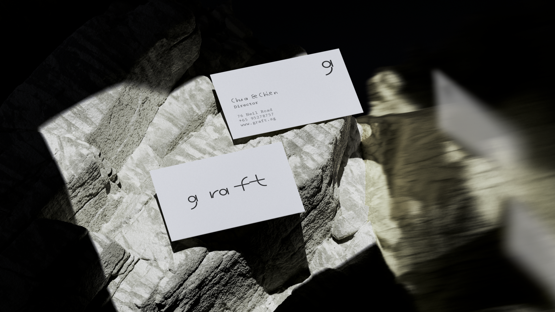
Graft
An eco-friendly bar with a novel drinking experience.
Graft takes its name from the plant propagation technique of grafting which unites a rootstock to a scion (cutting) for regeneration and growth. Graft’s identity is inspired by nature meets nurture, where concrete meets greenery, and where pure intention meets experimentation.
A focus on ingredients and flavor, brought forward through modern techniques. Respectful of and in harmony with surroundings.
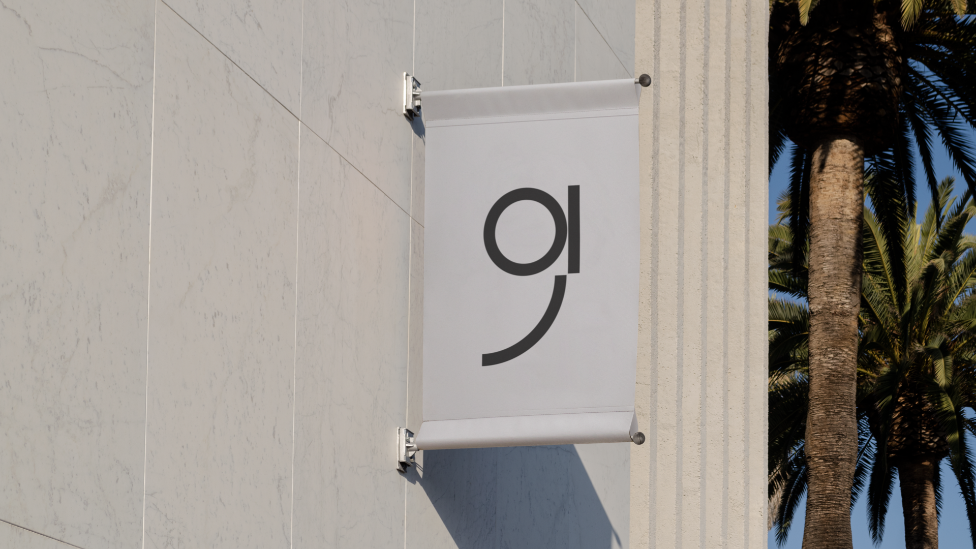
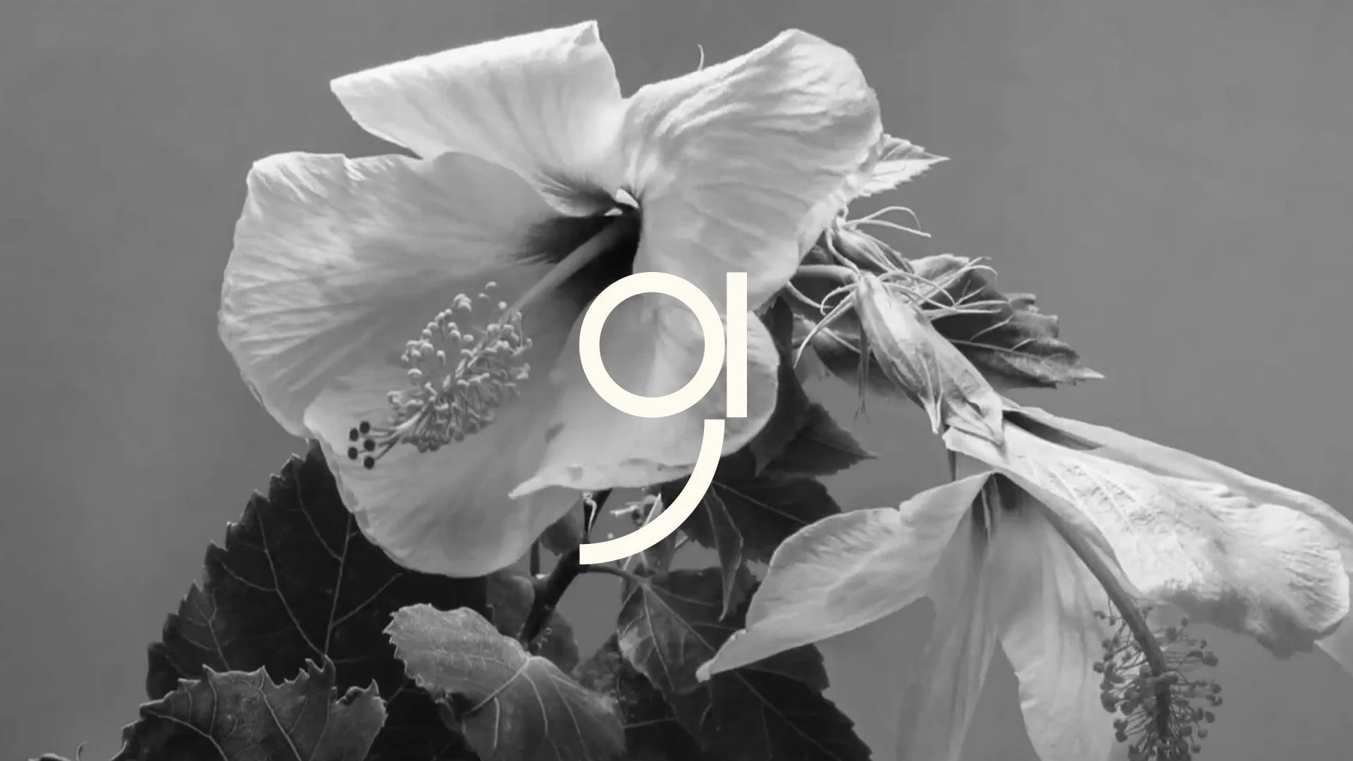
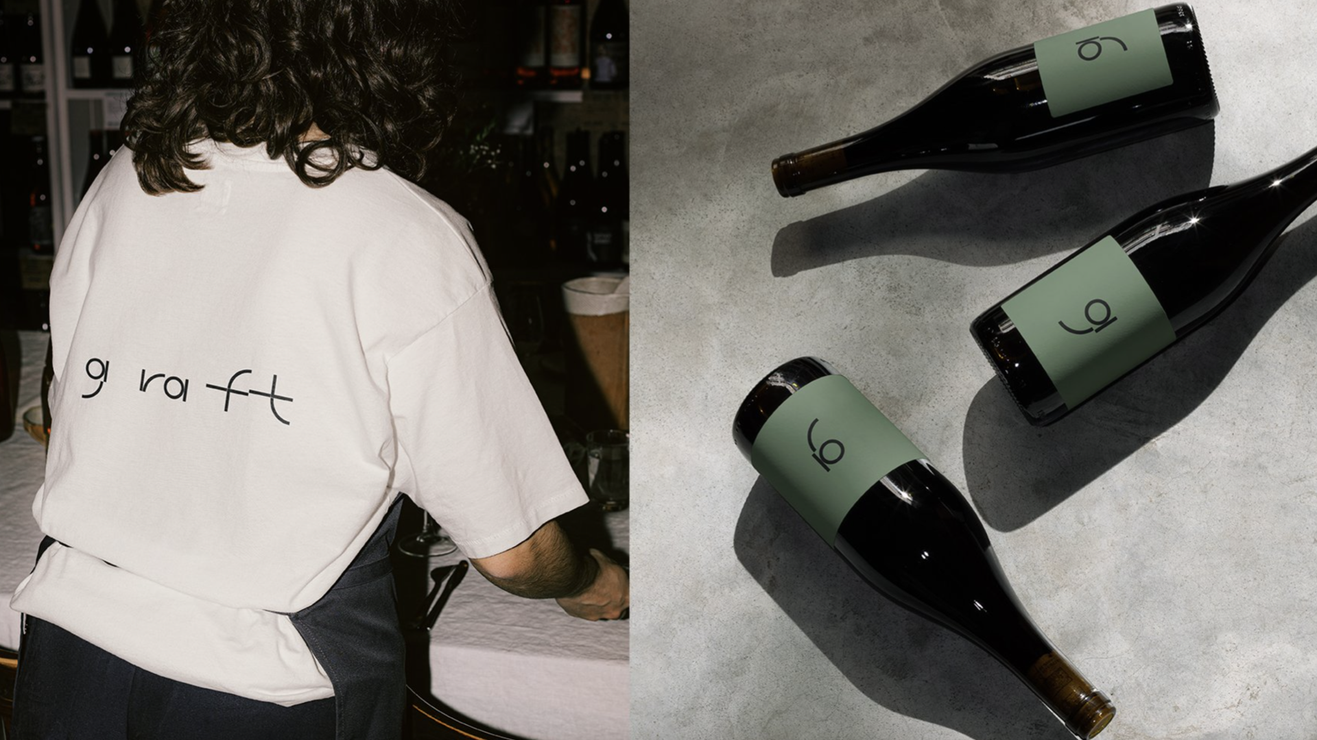
The logo is designed using the ABC Galapagos typeface, which is made up of a range of unique characters whose forms evolve from one another. Starkly futuristic, yet subtly biological. The intentional spacing of the typeface shows how nature is organic and reflects the capacity to thrive, generate new growth and creatively blossom. The subtle misalignment of the letter formation is a behavior that aligns with the brand concept of grafting.
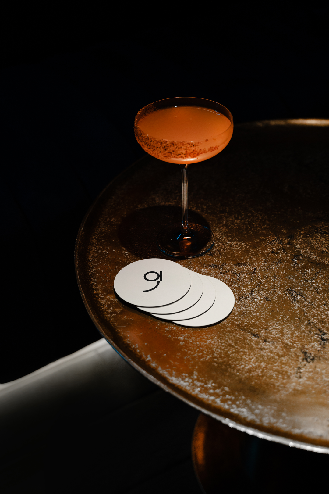
Graft speaks to the ‘democratizing the cocktail experience’ – to create a new way of enjoying cocktails.
Automated, big-batch drinks designed for accessible, daytime consumption. It speaks to nature and the green, edible aspects of space, but also captures the spirit of human experimentation and optimization, as it incorporate new techniques to advance the appreciation of mixed drinks.
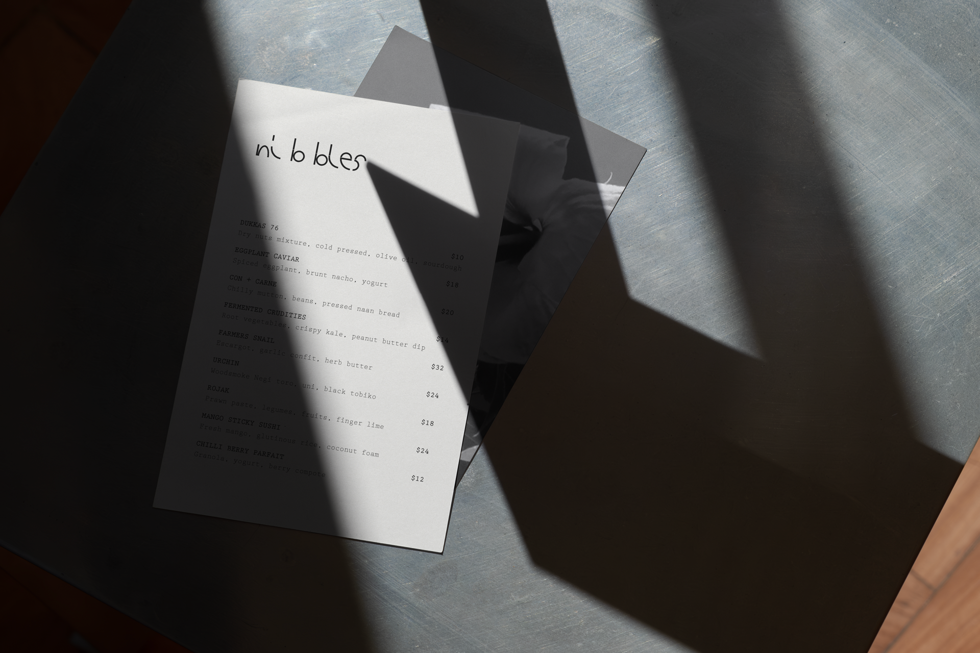
Graft’s food and drinks menu builds on the essence of locally inspired ingredients and flavors, melding this with European food techniques to create innovative new dishes.
Renewal from regeneration
Progress and continuation
The origin – the root
Fused with the scion
A purposeful union
The interstock
That extends life
Harnesses strength
And multiplies potential
Together, anew
Together, more
Abundant in fruit
Adaptive to change
Flourishing with renewed direction
Client
Mandala Club Singapore
Role
Branding
Art Direction
Graphic Design
Agency
The Third Space